
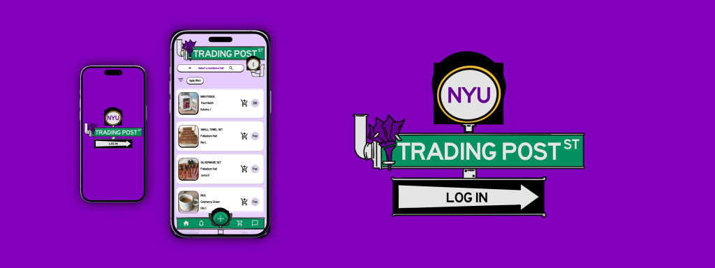
Full Case Study
Product Design
2024
Mobile App
NYU Trading Post
NYU Trading Post is an app designed to help students buy, sell, and donate dorm supplies and other secondhand items within their community, to combat yearly waste produced by universities.
Skills
Sketching
Wireframing
Prototyping
Design Systems
User Testing
Illustration
Tools
Figma
Procreate
Notion
Adobe Illustrator
Roles
Ideation
Research
Illustration
Prototyping
Design
Timeline
2 months
Conceptual project
Sole team member
Problem
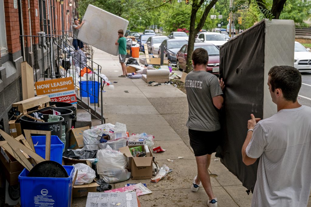
Every year college students create tons of waste in the US and internationally, trashing dorm items that are nearly brand new, mostly for the sake of convenience and lack of options.
Source: https://rachelcarsoncouncil.org/ending-campus-throwaway-culture/
In my own observations at university, when donation areas were provided during move out periods, they filled up faster than nearby trash cans, suggesting students prefer to donate when convenient.
Objective
Create an app to help students buy / sell / donate unwanted used items within the school community.
Hypothesis
Such a tool helps promote circularity combats trash waste & illegal dumping, reduces consumption, helps students on a budget, and allows others to earn money. It contains transactions and interactions inside school communities.
Process
→
Research
Define
LoFi Screens + Prototypes
Testing
Design System
Hifi Prototype
Testing
Final Screens
Conclusion
Research
Research on similar circularity-focused apps revealed that for the purpose of student community use, there are gaps.
Existing apps such as the ones displayed are either:
★ Solely for clothes, food, or restricted to geographic neighborhoods
★ Have functions not tailored to student communities or safety
★ Are not secondhand marketplaces specifically
I also had my own observations through the years as a student:
★ Nearby stores always sell out of similar items every single year, meaning students buy and discard the same things
★ Some students seek alternative methods of managing excess belongings such as opening instagram accounts to sell clothing, or texting large group chats to give away their things
Define
Pulling from my research and referencing existing applications for a proven standard, I worked out my core functionalities.
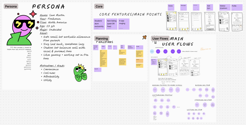
Core features / MVP:
– List an item
– Add to cart
– In app messaging
– In-app profile page
– Notifications page
– Exclusivity through NYU SSO login
LoFi Screens, Prototypes, and Testing
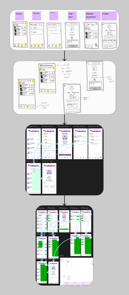
This stage was a faster paced evolution and contained multiple rounds of iteration. All user tests had 3 people/test, with goals being to find and complete all main interactions.
Users completed all main interactions
in the V1 wireframe.
Main changes in V2 included changing
a star item function to an add-to-cart,
and adding a rent feature.
I initially used a “star” function to have users
save items they wanted, but I discovered this was
unclear to 3/3 users; having an add to cart was
more standard and straightforward.
The rent feature was also suggested by 3/3
users, and a faculty advisor.
I added it, because in our community specifically
(and many international schools) there is a study
flow of students leaving and arriving for study
away. A rent would allow students to rent away
their things while they were gone, and get them
when they come back, serving doubly as storage
and income.
During testing of V2 all interactions were found
with no major comments or concerns.
Design System
Creating a small custom design system in preparation for the first version of the hi-fi prototype was necessary to ensure consistency across screens.
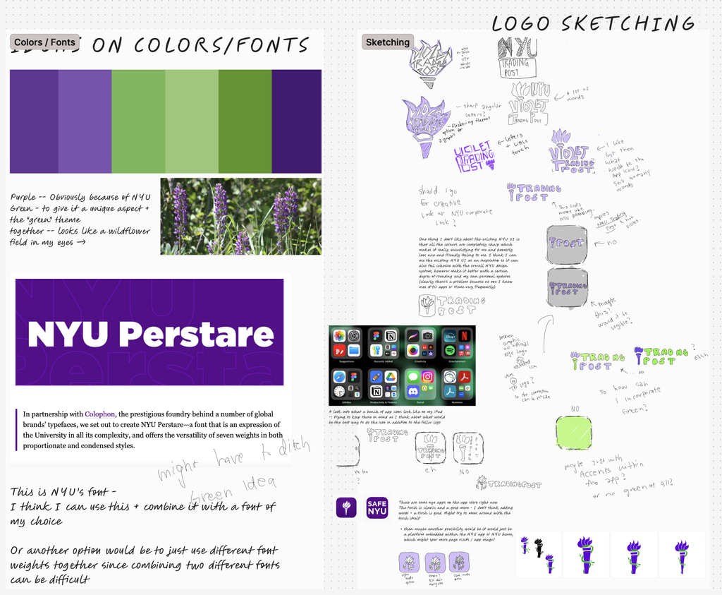
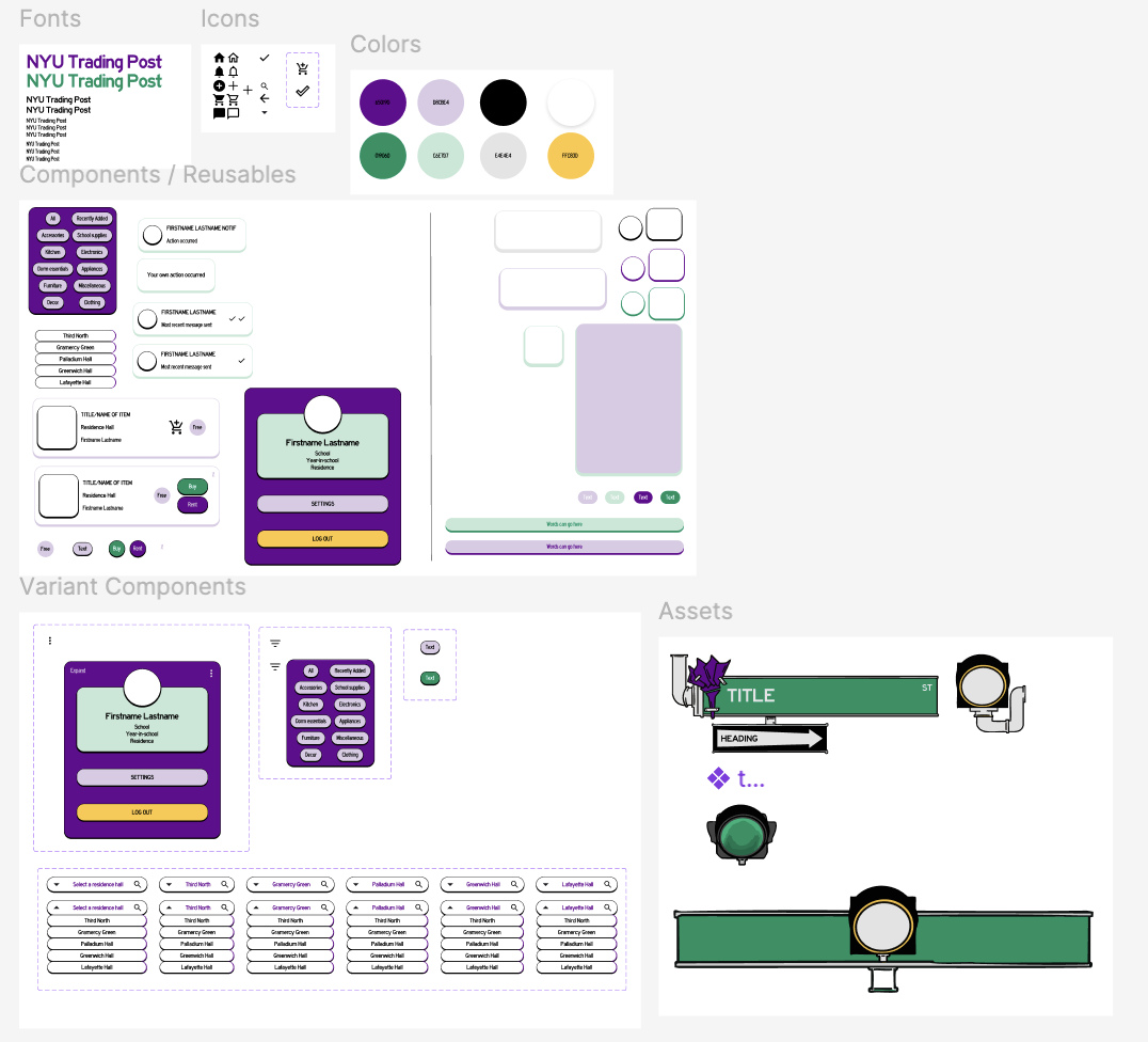
→ I went for a neobrutalist inspired look to go with the scrappy concept of secondhand selling & budget students, and also create differentiation from typical minimalist interfaces.
→ Creating a street sign theme was fitting for a school like NYU, adding a touch of personalization and element of fun. Theoretically, the theme could be custom for different schools. Choosing Highway Gothic for the font made sense with the street signs as well; it is highly readable, and is a familiar element of the North American highway and street system.
Hi-Fi Prototypes and Testing
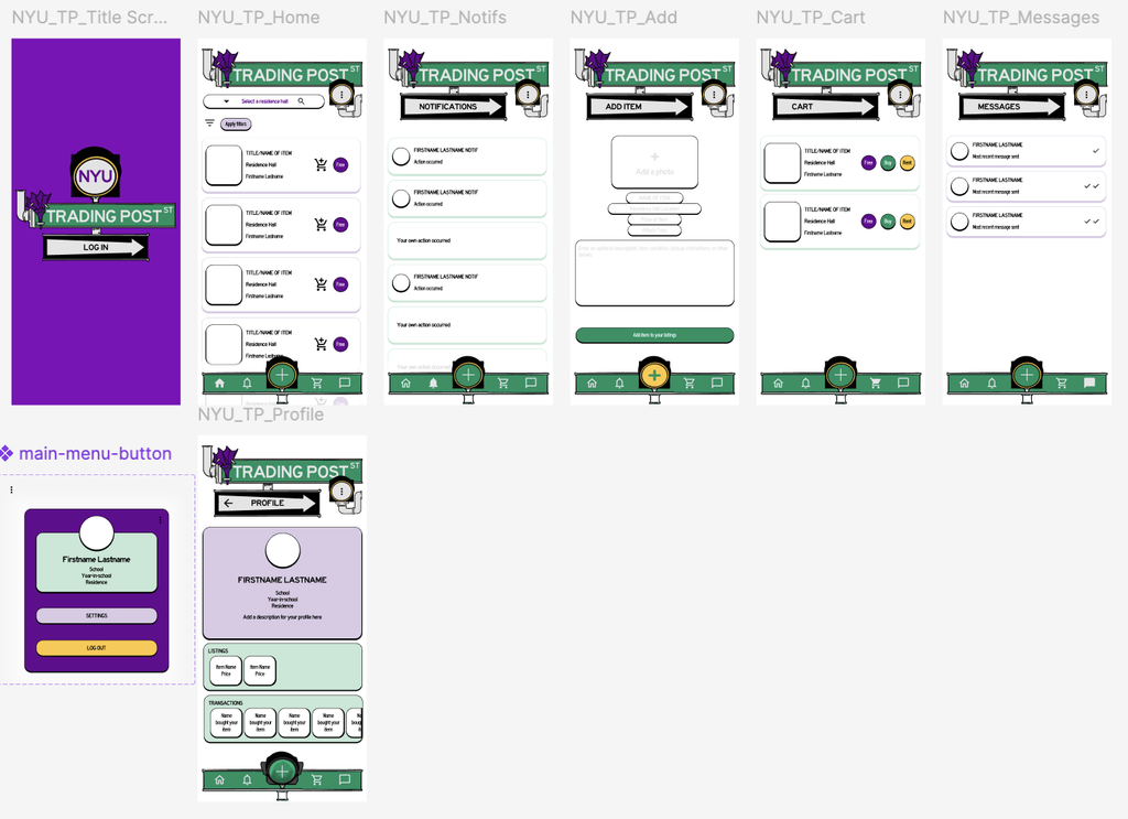
Testing this first version with 8 participants & using qualitative impressions led to the following actions:
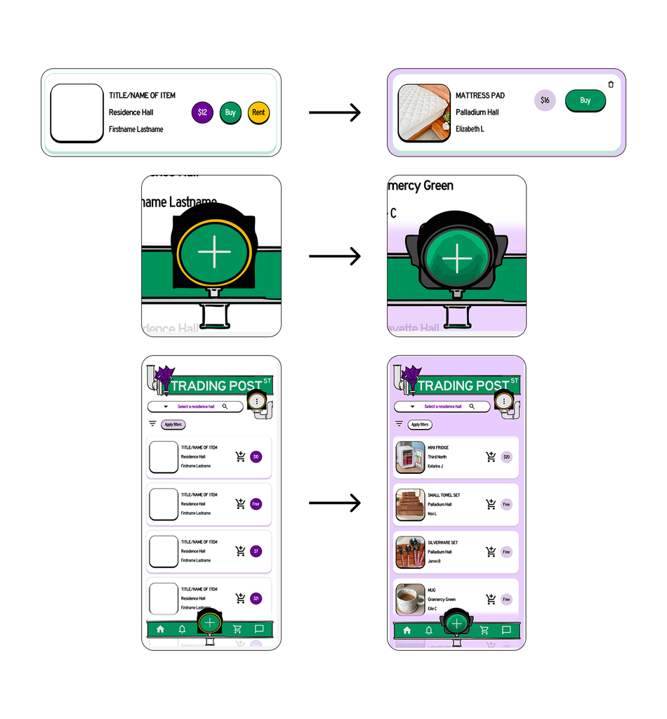
★ I removed the rent feature.
Although the previous reasonings for including this feature were justified, I felt unsure about the addition due to many dorm items being of a monetary low value. To verify, I asked more questions to 5 more students with no context. It revealed that renting, in practice, would be too much of a hassle.
“Dorm items are mostly so cheap and basic, I would rather buy them again instead of coordinating pickup and return with so many different people”
“I sublet my apartment while I’m away and my stuff stays there, so I don’t need to rent things”
★ The graphic (a single street light) that contained the + icon was illustrated unclearly and not everyone could tell it was a street light, even though they found the interaction without a problem. I re-drew it more obviously as a light.
Moving from the lo-fi to the hi-fi I also made sure to create a lot of prominence with the + icon, making it pop out from the rest of the nav bar slightly, because this is a key functionality.
★ I changed the white background to purple to create more contrast between item cards and other elements with the background; this made the seperation of elements more obvious. The white background also gave a slightly “unfinished” impression to some testers.
Final Screens
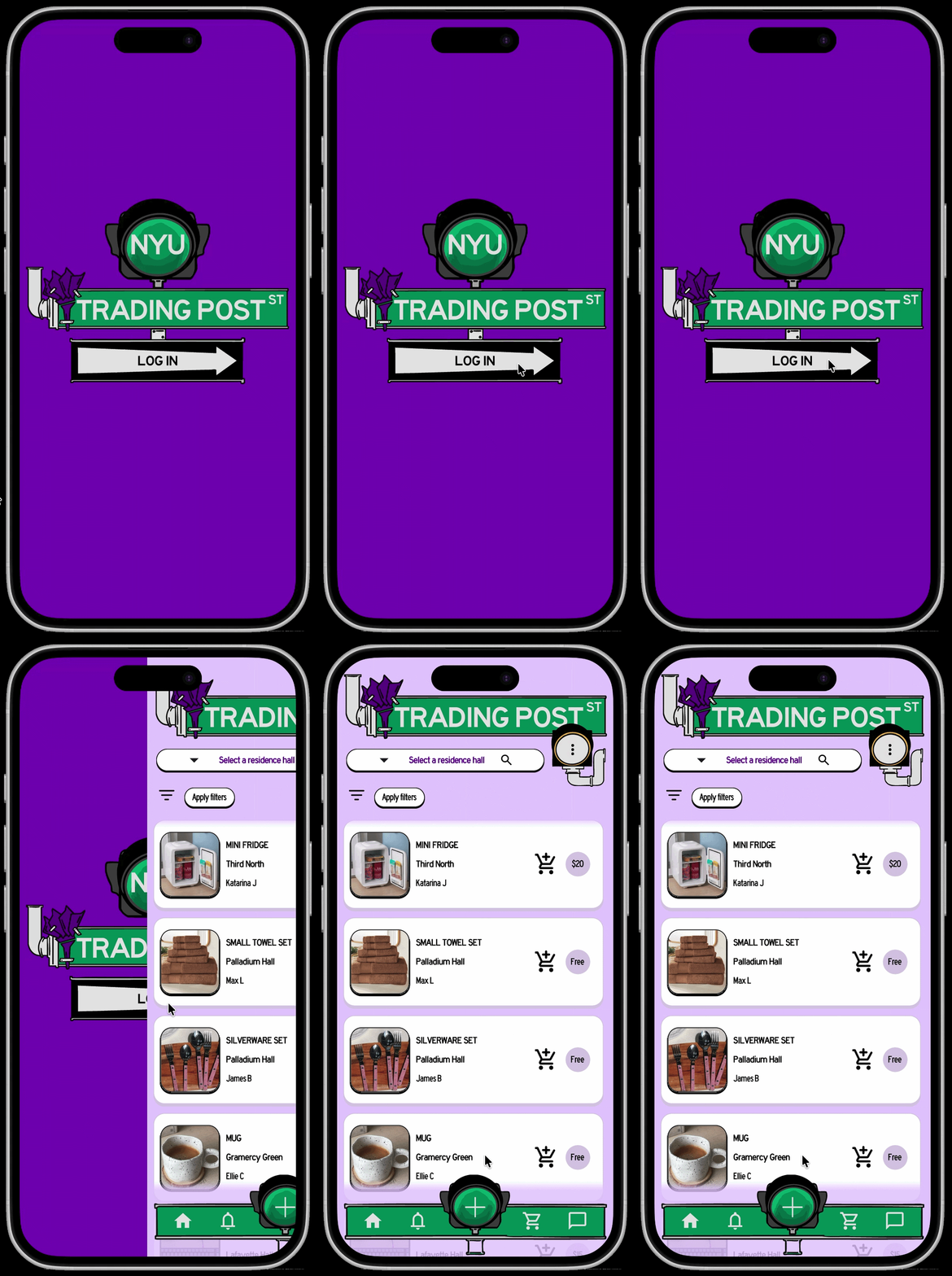
Log in.
This step would functionally include an NYU SSO login for student exclusivity.
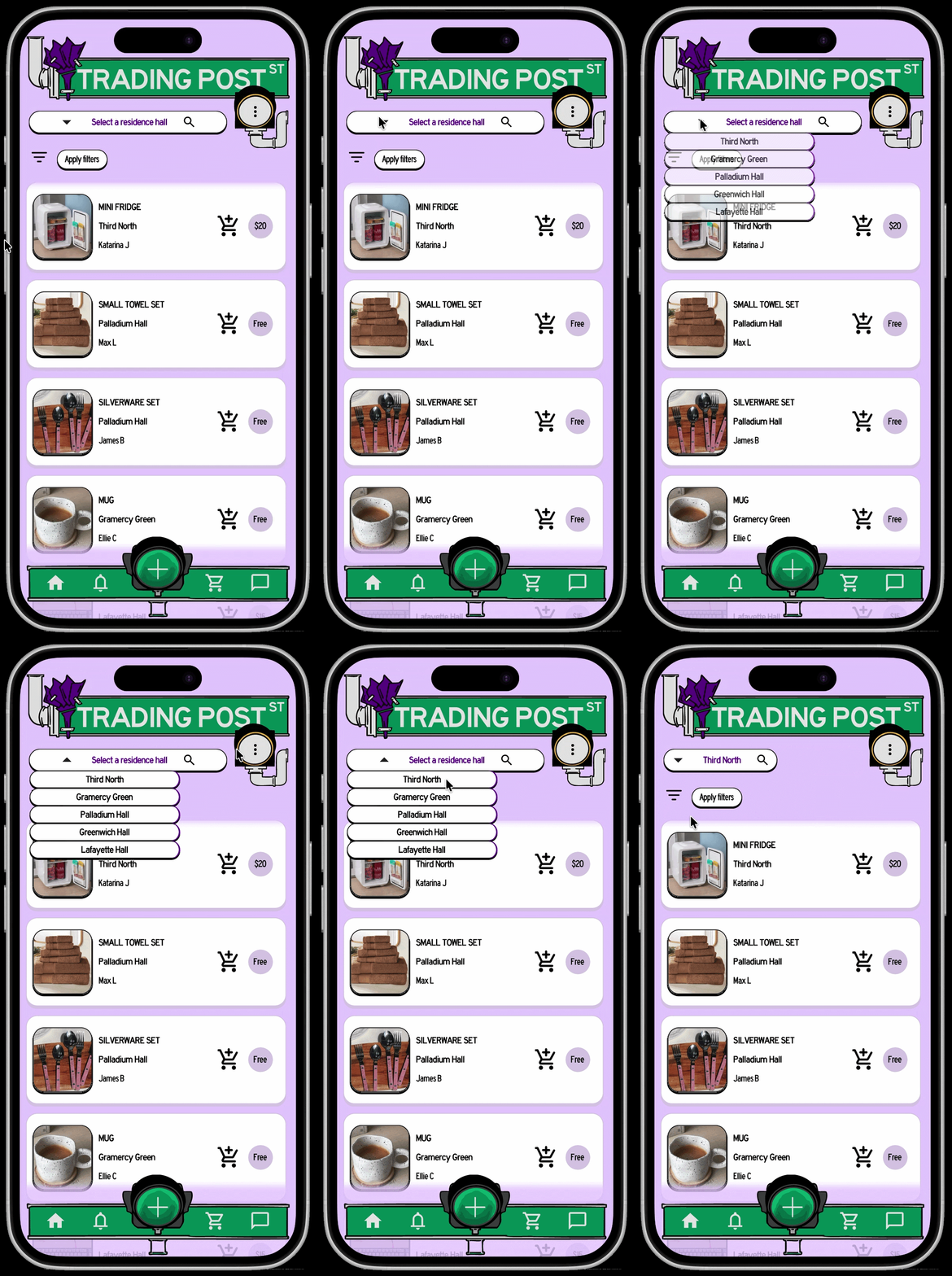
Select your residence hall.
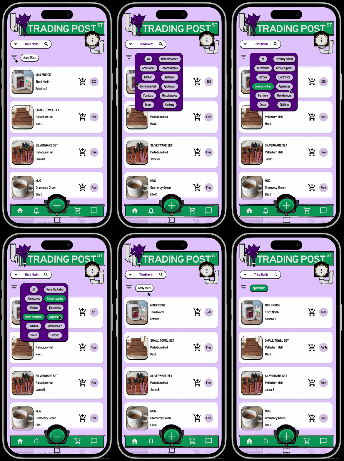
Apply filters to find what you’re looking for.
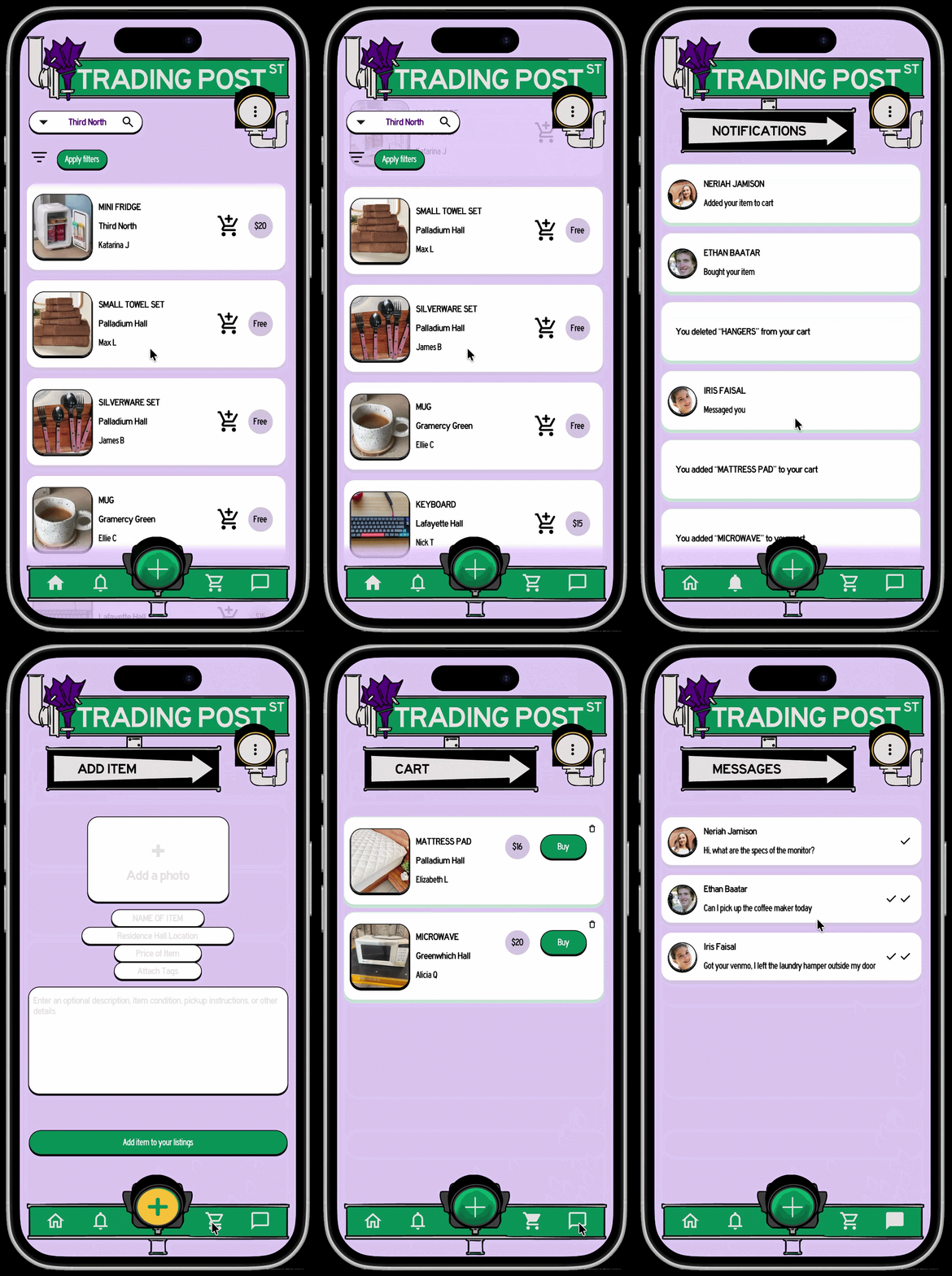
Scroll through listings,
see your notifications,
add a listing,
see your cart,
and check your messages.
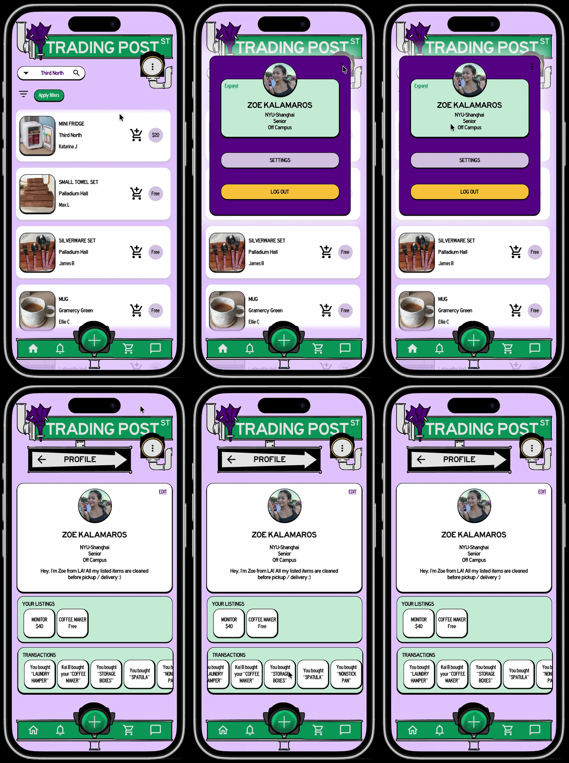
Briefly check your profile,
or expand for a detailed view.
Conclusions
What worked? What remains unvalidated?
Users could navigate and find all main features in the final design.
True success could be measured in a functional launch, where listed items + successfully purchased items could be tracked. If this were within the scope I would have loved to discover these metrics and improve upon them.
Next steps
→ Fleshing out fuller interactions: more pages & steps, error states, report/flagging systems, full purchase and dropoff logistics flow, etc. These were logical next steps from the beginning, however testers also asked about these inclusions as well.
→ Further editing to better comply with WCAG guideline specifics (touch targets, contrast ratios, etc)
→ Add off campus housing option, for off campus students
→ Reviews on student profiles, for a trust aspect
previous project…
next up…